

Previous post: The new symbol of Turkestan (II)
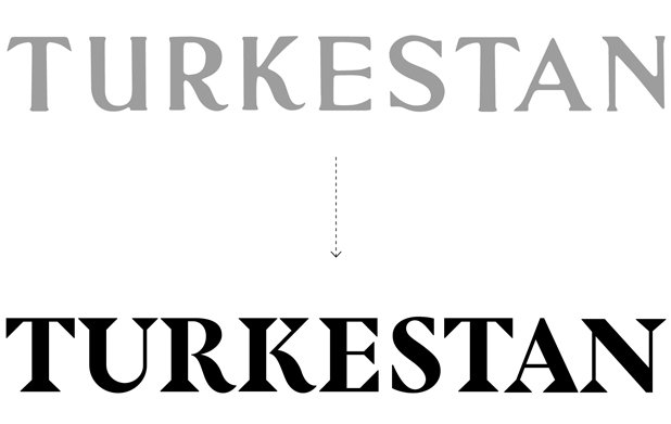
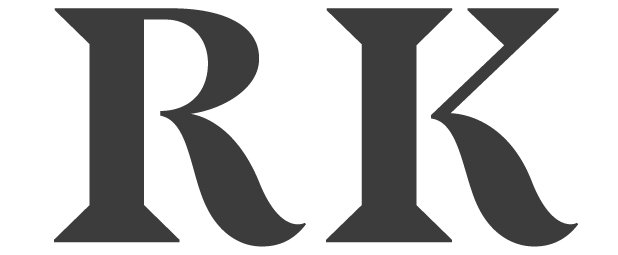
The characters that previously formed the word Turkestan were, most probably drawn freehand in the 1930s. As the project needed a top-to-bottom redesign, Albert Trulls designed this subtle lettering keeping the serif style of type and the characteristic curves (in letters R and K).
Logotype variations
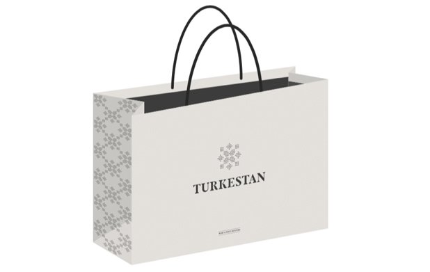
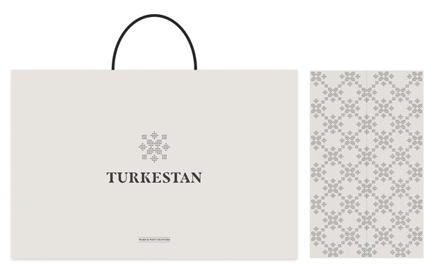
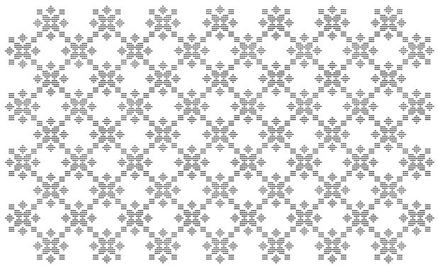
The new brand of Turkestan allows visual games that lead to different effects. The reiteration of the symbol generates patterns that recall the oriental mosaics. This effect has been used in some elements of our graphic brand, like hand-bags.
Post series of 'A renewed hundred-years-old project'
Turkestan: a renewed hundred-years-old project (I)
The new symbol of Turkestan (II)
