
Previous post: Turkestan: a renewed hundred-years-old project (I)
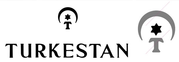
Based on the previous brand design, the proposal head towards an analysis of the previous symbol of Turkestan, which had three elements: an arabic moon, a star and a capital T. Albert Trulls’ proposal dismissed both the moon and the letter to work exclusively with the star, although he created a new sort of figure inspired in the so common geometric decorations and ornamentations in the arab world.
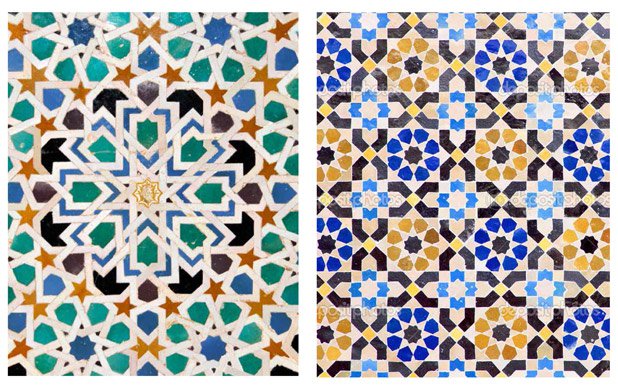
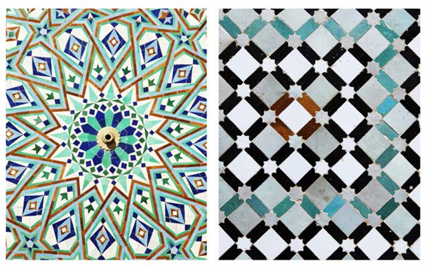
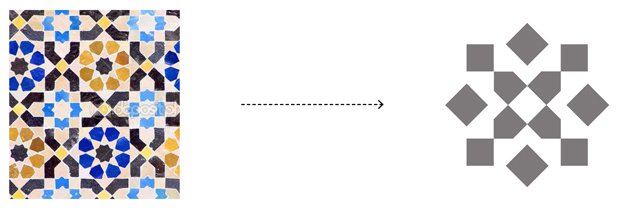
The resulting symbol clearly recalls the wall decorations of the Middle Eastern countries thanks to the specific combination of polygonal shapes. Moreover, these elements are conformed by an emphasized axial and radial symmetry.
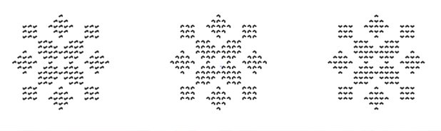
In order to compose the final logotype, Albert Trulls combined the new symbol with the three previous textures (the persian knot, the turkish knot and the flat weave) in an ultimate design. The final brand composition is very dynamic, as it can be displayed in three different versions.
Post series of 'A renewed hundred-years-old project'
Turkestan: a renewed hundred-years-old project (I)
The new logotype of Turkestan (III)
